FRAMAR
CLIENT
FRAMAR
MY ROLE
-
Project Manager
-
UX/UI Designer
PLATFORM(S)
Web - Desktop and Mobile
PROGRAMS USED
-
Adobe Illustrator
-
Adobe Photoshop
-
inVision
-
Shopify eCommerce
-
Google Drive
SUMMARY
Framar is a small family-owned company in the hair industry with a large customer base and a very strong social media brand. When looking at their old website, you wouldn't know that it's the same company you follow on Instagram. This stark difference was really hurting the company's credibility.
This website and product photography redo were completed over 5 months. I worked with a remote design/development agency to completely restructure the architecture of the site, bringing the shopping and the story of the company to the forefront. I also made sure that usability was a priority, all while modernizing the look at the same time.
The product photography was redone to make sure that all the products are shown as accurately as possible while being consistent throughout all 80+ items, and also creating a look for the brand.
This was an amazing project for me as it was my first experience as a project manager where I was the one making decisions for each aspect of the project, while also learning how to manage remote agencies and keeping to constraints.
Before and after comparisons of Framar's old and new websites.
MY ROLE
Since I was working as a Digital Content Creator for Framar, during their website redesign I was initially supposed to be working as the lead designer - creating wireframes, and page templates to later be handed off to the development team.
As we started going through the website bit-by-bit, we realized that we had more work cut out for us than originally anticipated. From then on, I took on the Project Manager role of the full website redesign. This role meant that I was corresponding directly with the design/development team and photographer, ensuring quality control and then taking chosen items to the Marketing Director.
This allowed me to take ownership of the project and allowed me to implement my vision for the new website across-the-board from the layout, the aesthetics, usability, product and lifestyle photography.
THE PROCESS
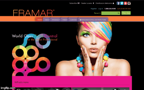
Framar's old website homepage, annotated with problem areas.
1. IDENTIFYING THE PROBLEM
Framar's website, originally designed in the early 2010s was created for the trend of that time but was never updated, so most of the elements, colours, styles are now out-of-date. For a company in the hair industry, where up-and-coming trends are at the root of what they do, this was a fatal flaw that hurt the company's reputation, reliability, and sales.
Framar's website had a few key functions: a place for hairdressers and salons to shop for their products, a resource to find key distributors and to learn about the company's story. Each of these tasks were difficult to find/maneuver through the website, resulting in the website having a high bounce rate at the homepage.
Additional problem areas of the website were:
-
lack of a call-to-action on the homepage to shop
-
inconsistent look between pages
-
reduced readability since the text was on intricate backgrounds
-
product photography was very inconsistent between products in terms of angles, photo sizes, and quality
-
website is overall cluttered and difficult to navigate
2. DEFINING THE PROJECT GOALS
Before taking on a 4-month long project that was so core to the company, it was important to set some goals, and define constraints.
Goals
-
Take all new product photography with consistent angles, sizes, and that accurately represent the product
-
Create a more cohesive flow between key user touchpoints (such as shopping, finding distributors and contacting the company)
-
Strengthen the company brand through similar colours, themes, visuals
-
Have everything on the website be of the highest quality content-wise and looks. Being intentional about what we put on the site
-
Create a primarily mobile-responsive site
Constraints
-
Use the Shopify platform to create the website
-
Complete the project within 4 months
-
The existing users of the website will have to relearn the new platform, so not making it drastically different in terms of wording and organization are important
2. FINDING INSPIRATION
Getting started with thinking of the redesign, I wanted to gather inspiration from other websites, specifically those of companies also in the hair industry to see the trends and most important features. Here are many of the ones used in our mood boards

Maapilim: lifestyle photos

Shadows, angles & neutral background


Amika: find distributor layout & location pins
Pop of colour and nice arrangement

The neat layout of the nav bar dropdown
2. SETTING UP THE PAGES
At the beginning of the project, when I was still the designer, I came up with some rough wireframes of how I wanted the new pages to look, just to get a sense of the architecture of the whole site, how to structure content and determine levels of importance.
HOMEPAGE
The most important elements are the shopping call-to-action (CTA), then finding a distributor. These are highlighted, then the other actions (cart, profile, search etc.) are laid out neatly in the navbar.


DISTRIBUTORS
Originally, the 1300+ distributors were laid out in a list, making it tedious to find what you're looking for. This is redesigned into a map with the list view still available alphabetically at the bottom.


PRODUCTS
You can't tell in this screenshot because the new product photos were implemented, but each photo was different dimensions so the redesign made this more streamlined, highlighting the different products and collections.


ABOUT
Since Framar is a family-owned business, the about page is important and has to tell a story. The original was quite cluttered, and I wasn't able to find the image for it but the wireframes intended to add more pictures and some testimonials as well.

Each page has a unique purpose and CTA, so I wanted to go through and make sure they were all highlighted. In my vision, I quite liked the way the original website had each section with a dedicated accent colour, so I kept that.
3. PRODUCT AND LIFESTYLE PHOTOGRAPHY
When looking at Framar's old product photography, each of the products looked relatively fine individually. The problem, however, was that when you looked at all the products together, you're able to tell that each were either taken at a different time, or it wasn't considered that angles, sizes of the product, and colours had to match.
Similarly for the photos taken of the product collections (eg. all gloves), instead of a photo taken with each product placed intentionally, many of these photos used the individual product photos and photoshopped them together. In this case, you can really see the different angles and styles of the photos among them, such as the gloves below.


Examples of old product photography showcasing inconsistencies.
To keep this part of the project organized, we used a series of excel spreadsheets outlining the products and how many/which angles to shoot, and a google drive of the images in the works to review and approve. This allowed us to be involved in all of the steps, from taking the photos to the final edits and ensure that our vision was being met.
So what did we want to change when conducting the over 100 product reshoot?
-
Product photography
-
Have two versions of each product photo: a transparent background and the other with a neutral background (#EBEBEB), all the same dimensions and a square
-
Assign specific angles that are generic enough to work with most products (and then have additional for those that need them)
-
To create a digital shadow, a more modern version of the mirrored effect with the previous photos
-
-
Lifestyle photography
-
Each collection should have a pop of colour that fits with the Framar brand (pastels; pinks/purples/blues and greens)
-
Create a photo for each one with unique product placements and props if necessary, ensuring that all products are cohesive
-


Examples of new product photography showcasing improvements.
4. THE FINAL PRODUCT
The final website, after development, was a Shopify-based e-commerce platform with the main functions of shopping, finding distributors around the world, and to learn about Framar's story. The new layout created an architecture of information that highlighted the most important and most frequently used part of the website and made them more apparent and visible.
I was very happy with this final product, it definitely captured the vision I had set out for it at the beginning. Each page was cohesive with the others, the product photos accurately reflected the actual products, the about section told a story about the company and the family, and overall the website was up to date with current standards and aesthetics.


Sample shots of the final Framar desktop and mobile website.
CHALLENGES & TAKEAWAYS
Reflecting back upon the completion of this project, I learned a lot about project management, leading a design team, development team and a photographer. My main challenges were understanding the ins and outs of e-commerce and the Shopify platform to figure out the most important elements and how to showcase them. It was also a very interesting project because the external companies hired to do the design/development were remote, and so was the photographer - all based in different areas. This allowed me to work on my communication skills even further to learn how to work with remote teams while still making sure work gets done.
My main takeaways were quite diverse. Working on this project, I realized that I really like roles where I get to with, and coordinate, different teams to implement a vision shared by me and the company. More specific to the website itself, I learned a lot about website structure and the process to go through in order to redesign one. If I were to do this project again, I would focus a little bit more on analytics and understand how those affected the website performance, and also using them to make decisions with a solid reason behind them.